Logo
How we created a logo for our project
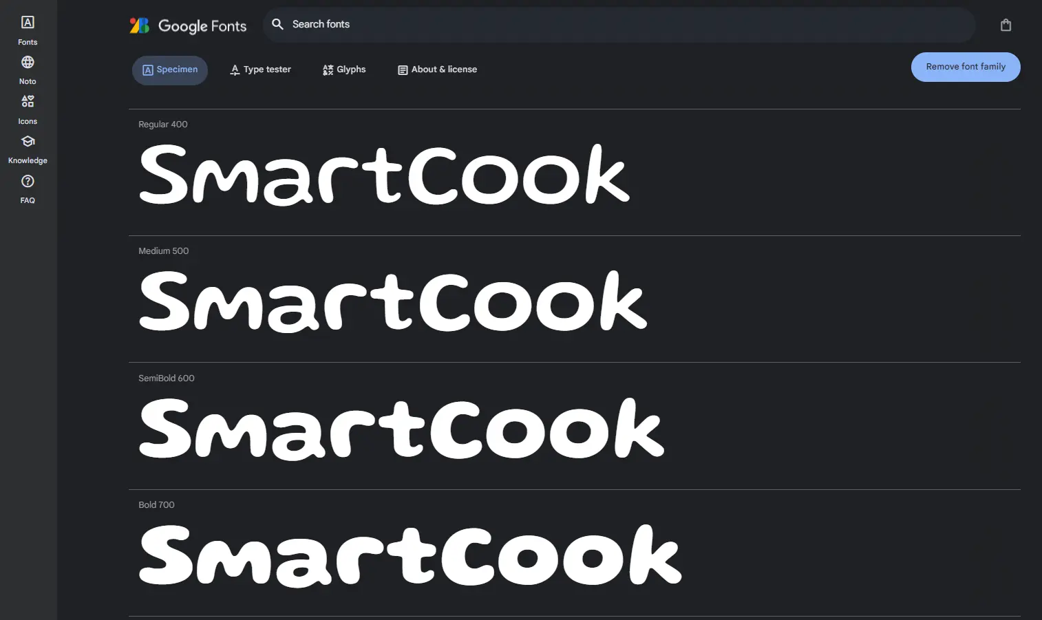
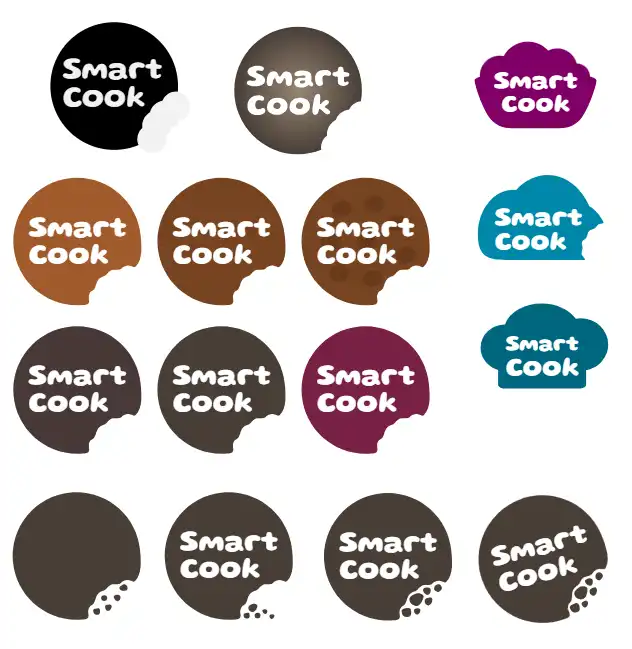
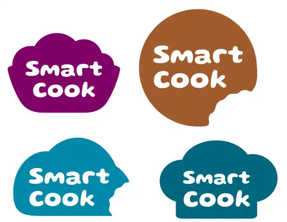
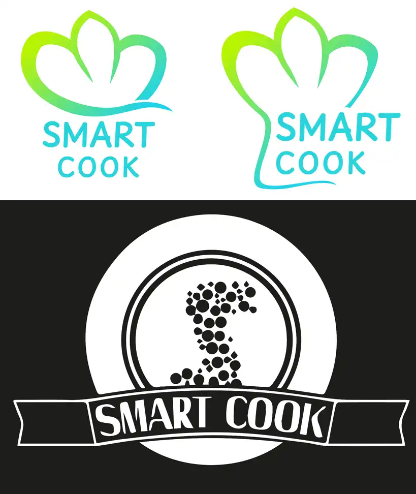
The creative process for designing the logo for the SmartCook cookbook was a journey of experimentation and discovery. The team explored various concepts, experimenting with different shapes and designs that could encapsulate the essence of a smart culinary guide. After numerous iterations, the winning design emerged: a charming cookie emblazoned with the SmartCook name, symbolizing both the smartness and the cooking theme of the product. The final touch was selecting the perfect font to complement the logo's friendly and approachable vibe. After much deliberation, the choice fell on Gluten from Google Fonts, known for its clean and modern feel, which aligned seamlessly with the brand's identity. This meticulous process not only resulted in a visually appealing logo but also one that resonates with the innovative spirit of SmartCook.
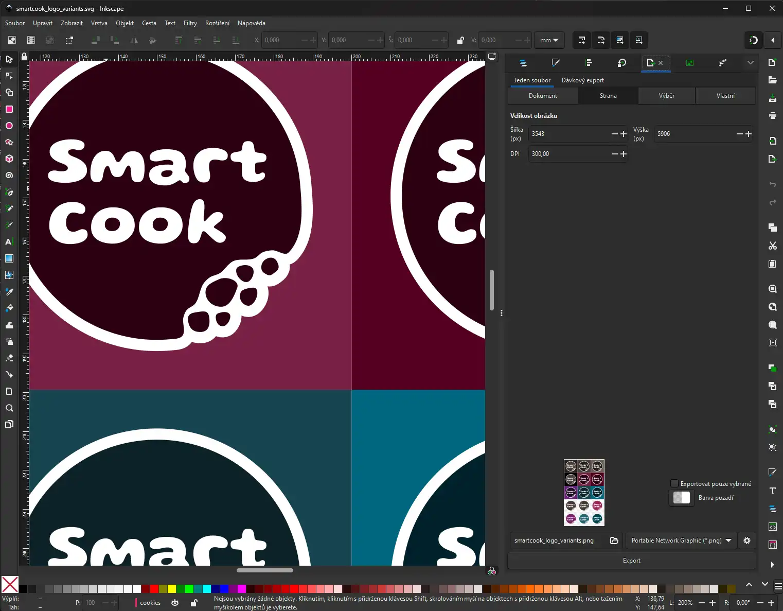
We used Inkscape to create the logo.
Logos for download
Screenshots
